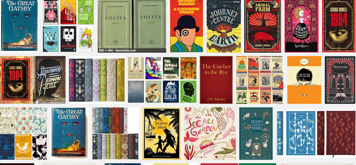
Tips for good ebook covers: general rules

Every format has its own characteristics. Apart from the size, to design a cover for a paperback book is quite different than to do it for a Kindle ebook.
Not only paper-book covers are seen - by all of us - in colors, while on our Kindle we see them in shades of gray. Also, ebooks are usually shown in miniatures, or thumbnails, on the stores. This changes quite a lot how you have to make your cover design.
But let's start from the beginning, there are many useful tips. Which are the most important features of a kindle cover?
Here there are four simple rules to follow:
1) First of all, it should stand out from other covers on the store's shelf;
2) it should convey the mood your story;
3) if you propose yourself to publish a series, with more books to come, it would be a good idea to start a brand, with common features that will be present in all of them
4) the cover has to be of high quality. If the quality is lacking, the reader will think that the writing will be poor too.


you need to login or register to post a comment