Tips for good ebook covers: Inspire yourself
Here we come to the last point of our tips for good ebook covers, or in this case, even for paperback books. That is: look at the others. First of all, don't think you can design the most innovative cover ever. In second instance, get inspired by the success cases or by any author who has written something of the same genre of your book. As any good artist, everyone who is going to create something has to get inspired. It could be a spontaneous inspiration, but every writer knows that what one writes is the sum of creativity and experience of what he has read before. Every artwork or book that we enjoy, we take a little part of it inside ourselves. Then, our creativity manipulates it to create something new. It's something that is going on since humankind had been born, and there's nothing wrong in it. So don't feel shy to look at other covers to create your own style. There's only one thing to be careful of: not to take the all package altogether, copy it and past it in your cover. In other words, take inspiration, don't steal ideas. If you copy something, you could end in some copyright issues. Here there are some links that could help you in this matter: - A quick Google search on classic book covers - A website with 86 excellent cover designs - The book cover design archive, with tons of covers to look at. Eventually, the last tip we can give you is: make it simple. A good design is simple, a good story is written around a simple concept. It's even more important on stores such as Amazon because you'll have a little thumbnail as cover, among a messy amount of dozens of other ones, especially badly designed ones. A simple, good looking cover will shine in the mess like a beacon in the night.
Tips for good ebook covers: author and title
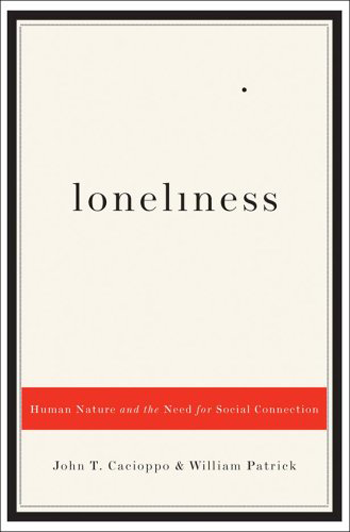
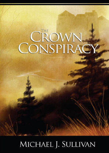
Here we go. Where should I put my name as the book's author and the title in the cover? You could ask like that. And you could think, also, that because they're the main thing they have to stand out and be big. You can do like that, but you're risking to override all the rules we're talking about in these posts. Secondly, the bigger is your name, the more you will appear as pompous and desperate for fame and glory. Here below we put two examples of good Indie authors.As you can see, the two covers respect fully what we've explained inside the posts, about colors, spaces and so on. If we resize them into thumbnails, on the cover on the left we'll see just the "what" word and the picture, while on the cover on the right just the picture will be recognizable. That means, again, that the purpose of these covers is to convey the mood of the books. Apart from that, we can see clearly that the mood is not particularly interested in the words, in these cases, but pictures and spaces. The author's name, your name, should be written in medium-small font size, almost always in the bottom part of the cover. In any case, if people will like your book will remember your name. Otherwise it will never happen. Title can have more space and could be bigger, if it's useful to do so. It just depends on what you want to convey with your cover. If you can create a title inside an image - but that could be seen as a thumbnail - it would be the best solution.
Tips for good ebook covers: typesetting

Have you ever thought about not putting any background picture to your cover? Already wrinkling your nose? But still, it could be the best solution. Pictures help but they aren't everything. There are many already published covers which don't use images. Let's see some examples here below: Ok, most of them are not for sure fantasy or mystery kind of stories. As a matter of fact, we can say that mostly good typesetting is from essays or descriptive books. Still, there are examples of good covers used by novelist. Here there's one: All these covers were taken as examples from bookcoverarchive.com. It’s basically an archive in which you find lots of covers of already published authors. It’s a good source from which you can take inspiration. Now, if you want to take this way for your covers you have to try many times before getting one which will suits your story. You just have to choose the right colors, the right fonts - look this post in which we're talking about them - and right spacing between the letters. Shadows and other effects Small effects like shadows are alright. But it's not just a coincidence that in our creator we didn't put any 3D or big drop shadows effects. The reason is even though you can think they help the text to stand out, actually they make it more complex. It's harder for the eye to understand. It's ok sometimes to use a shadow for an image, but avoid it whenever possible for texts. If you want to let them stand out, work on and experiment new colors and font types.
Tips for good ebook covers: fonts
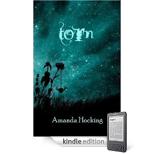
You have made a cover for a story set up in Paris in the night, or a mystery story. So you look on the Internet to look for some very "cool" font, something very Italic or creative, with many curves. Forget it. Let's look to an example, but this time let's start from the thumbnail, because it's the first reader impression. Can you read the title immediately? Most probably not. So what a reader will do? He will skip it and pass on. Another important rule is, don't choose home-made free fonts. Usually they have size, weight or illegibility problems. It's alright if you don't want to pay for them. Our creator offers already a large variety of professional fonts you can use and experiment easily. But the most important thing is to be readable at the first glance. If it doesn't, it's not functional. It's really better to go for something classical and clean. In the case of the font, it's not so much important you use one giving the message of your story. Let's look the big image of the book above. Now we can see the title is Torn, although we still have some difficulties, especially about the T. Now the font is strange but still readable. The author later changed the cover into another one, that is even worse according to us. Here below there are the actual size version on the left and the thumbnail version on the right. Can you read the title? What can you infer from the cover at the thumbnail size? In this case, still, the author has made a trilogy, so every book of it has the same kind of image for the title. Without really being able to read it. In conclusion, fonts must be clear and readable. There's no escape from that. And always remember that printed covers are different from ebook covers. Here below there's an example. It's a New York Times bestseller, in the paperback edition. Of course then the author hasn't changed a little the cover while making the Kindle edition. However, here is where it fails. While this font is very readable in big sizes, when it comes to thumbnail we can't read almost anything. That's another reason why if you want to publish both in ebook and paperback format it's better to use different fonts while changing the format, or otherwise use one that is just clear and readable for both.
Tips for good ebook covers: space
Space is like drawing, and it's like writing. You just have to be balanced, in harmony with every other object inside the cover. It's the same as using metaphors in your writing, for example. You have to give them space, but you can't neither give them too much space, otherwise everything will appear clumsy. The problem is, one can think that because his cover will appear as a thumbnail on a store, it's better to make everything as big as possible, to capture the reader's attention. But it doesn't work like that. First of all, you should try, edit, erase and start over again many times before you get the best result. If you look for getting the whole space filled, try to do the opposite: leave as much empty space as possible. Use less objects. Elements should capture the reader's eye but not let it escape. So the best solution is to give the items a good space to breath. Here below there are two examples. These covers are from good-seller Indie authors. Each one conveys its own mood through space too. We talked about colors' use in this other post. What's the main characteristic in these two covers? They are very much balanced, even if very simple too - as a matter of fact, you can make them in our creator. In the one on the left, there's a picture in the middle, and a big title above, while in the one on the right the image is the title. In both cases, the author's name is put below everything - it has to be the element with less importance. But how they will appear in thumbnail? Let's see. Of course we can't see almost anymore the author's name. But the first thing that will catch our eyes is the main title. In the first image, then, it will give us curiosity and still more the picture, so we'll be encouraged to open it and look inside. The second one is giving us curiosity by the sense of mystery that is creating - and beauty too. But the main thing, as you can see, is that there are very few elements inside, and lots of empty space. So that's how it should be.
Tips for good Ebook covers: colors
Among the many aspects one has to meet with, there's the one of colors. It's one of the most difficult to manage, but here we'll explain some helpful tricks. It's hard to use correct colors because they have to be in harmony among them, they don't have to interfere neither stress items too much. Also, texts should be contrasted with background images, the latter maybe of many shades, dark and bright too. How can we escape from being ordinary? Let's see some suggestions. The most important thing is offered by our creator, that is the opportunity to change the color in real-time while doing your cover. This will allow you to modify it and adjust it according to the items you're using. We have two kind of color usage. Thin colors or bold colors. In the first case you'll have to use similar colors which will create harmony; in the second, you should create contrast instead. In any case, you should never use more than 3 colors in total - including images, shapes and texts. As you can imagine, it's better to avoid the strong primary colors, such as full red, full blue and full green. You can start from them, but later it's better you create your own pattern or shade. Remember that a gradient, if used in a proper way, will give a sense of three dimensions to your objects. There is another case: your story is set in a particular country, you can use the country's flag colors, or very similar ones, with pictures of other kind. One can also search on Google, for example, colors that work well together, or something similar, to get more information about complimentary colors and so on. Or you can look for color palettes. In such a way you can see all the colors next to each other, to have a proper idea. Here there are two examples. Eventually, the most important thing is to try as much as possible new combinations, until you find the one that will convey the book's mood. As we could see in the book's cover of Meredith Wild, she used dark colors inside, but just three of them: purple, black, and white with little yellow shade for the texts. Apart from these last ones which had to be contrasted to the rest, the colors are in harmony between each other and set the mood of the book.