Tips for good ebook covers: fonts

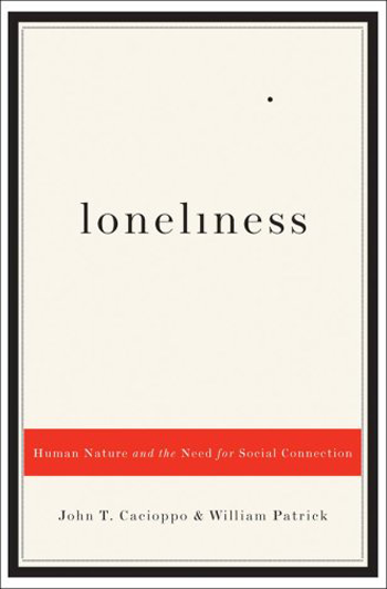
You have made a cover for a story set up in Paris in the night, or a mystery story. So you look on the Internet to look for some very "cool" font, something very Italic or creative, with many curves. Forget it. Let's look to an example, but this time let's start from the thumbnail, because it's the first reader impression. Can you read the title immediately? Most probably not. So what a reader will do? He will skip it and pass on. Another important rule is, don't choose home-made free fonts. Usually they have size, weight or illegibility problems. It's alright if you don't want to pay for them. Our creator offers already a large variety of professional fonts you can use and experiment easily. But the most important thing is to be readable at the first glance. If it doesn't, it's not functional. It's really better to go for something classical and clean. In the case of the font, it's not so much important you use one giving the message of your story. Let's look the big image of the book above. Now we can see the title is Torn, although we still have some difficulties, especially about the T. Now the font is strange but still readable. The author later changed the cover into another one, that is even worse according to us. Here below there are the actual size version on the left and the thumbnail version on the right. Can you read the title? What can you infer from the cover at the thumbnail size? In this case, still, the author has made a trilogy, so every book of it has the same kind of image for the title. Without really being able to read it. In conclusion, fonts must be clear and readable. There's no escape from that. And always remember that printed covers are different from ebook covers. Here below there's an example. It's a New York Times bestseller, in the paperback edition. Of course then the author hasn't changed a little the cover while making the Kindle edition. However, here is where it fails. While this font is very readable in big sizes, when it comes to thumbnail we can't read almost anything. That's another reason why if you want to publish both in ebook and paperback format it's better to use different fonts while changing the format, or otherwise use one that is just clear and readable for both.
Tips for good ebook covers: space

Space is like drawing, and it's like writing. You just have to be balanced, in harmony with every other object inside the cover. It's the same as using metaphors in your writing, for example. You have to give them space, but you can't neither give them too much space, otherwise everything will appear clumsy. The problem is, one can think that because his cover will appear as a thumbnail on a store, it's better to make everything as big as possible, to capture the reader's attention. But it doesn't work like that. First of all, you should try, edit, erase and start over again many times before you get the best result. If you look for getting the whole space filled, try to do the opposite: leave as much empty space as possible. Use less objects. Elements should capture the reader's eye but not let it escape. So the best solution is to give the items a good space to breath. Here below there are two examples. These covers are from good-seller Indie authors. Each one conveys its own mood through space too. We talked about colors' use in this other post. What's the main characteristic in these two covers? They are very much balanced, even if very simple too - as a matter of fact, you can make them in our creator. In the one on the left, there's a picture in the middle, and a big title above, while in the one on the right the image is the title. In both cases, the author's name is put below everything - it has to be the element with less importance. But how they will appear in thumbnail? Let's see. Of course we can't see almost anymore the author's name. But the first thing that will catch our eyes is the main title. In the first image, then, it will give us curiosity and still more the picture, so we'll be encouraged to open it and look inside. The second one is giving us curiosity by the sense of mystery that is creating - and beauty too. But the main thing, as you can see, is that there are very few elements inside, and lots of empty space. So that's how it should be.
Tips for good Ebook covers: colors

Among the many aspects one has to meet with, there's the one of colors. It's one of the most difficult to manage, but here we'll explain some helpful tricks. It's hard to use correct colors because they have to be in harmony among them, they don't have to interfere neither stress items too much. Also, texts should be contrasted with background images, the latter maybe of many shades, dark and bright too. How can we escape from being ordinary? Let's see some suggestions. The most important thing is offered by our creator, that is the opportunity to change the color in real-time while doing your cover. This will allow you to modify it and adjust it according to the items you're using. We have two kind of color usage. Thin colors or bold colors. In the first case you'll have to use similar colors which will create harmony; in the second, you should create contrast instead. In any case, you should never use more than 3 colors in total - including images, shapes and texts. As you can imagine, it's better to avoid the strong primary colors, such as full red, full blue and full green. You can start from them, but later it's better you create your own pattern or shade. Remember that a gradient, if used in a proper way, will give a sense of three dimensions to your objects. There is another case: your story is set in a particular country, you can use the country's flag colors, or very similar ones, with pictures of other kind. One can also search on Google, for example, colors that work well together, or something similar, to get more information about complimentary colors and so on. Or you can look for color palettes. In such a way you can see all the colors next to each other, to have a proper idea. Here there are two examples. Eventually, the most important thing is to try as much as possible new combinations, until you find the one that will convey the book's mood. As we could see in the book's cover of Meredith Wild, she used dark colors inside, but just three of them: purple, black, and white with little yellow shade for the texts. Apart from these last ones which had to be contrasted to the rest, the colors are in harmony between each other and set the mood of the book.
Tips for good Ebook covers: Drawings

About drawings, it's valid what we have said in this post about getting together images. Try to not make them by yourself. It's a general rule for everything. It's good you can create your own cover, but use good quality images, always, as the ones we're offering you or from the websites we told you in the post on how to look for images. It's possible to think that making everything by yourself will give a special touch, especially if you created the book, the cover, the formatting and everything else. For sure there will be among you some good drawers, or you have a friend of yours that is good in drawing. Still, a potential reader looking among the mass of thumbnails on a store will notice immediately if you have an amateur drawing. So, what to do if you don't want a photo but an illustration? Choose one among the ones we're offering you, or go to iStock and the others. It's very cheap, there are many good works and you will have a professional drawing. Illustrations, especially, always come with a JPG and a Vector file, so you can modify them with some professional editor. Here there are some examples that you can easily find on iStock.
Tips for good ebook covers: composite pictures

Let's suppose you have found some images which fit perfectly to your cover. The first impulse will be of putting them together, in some way. Well, it's better not to do it. In first instance you can do it just if you are a Photoshop or a Gimp magician. Meaning you are a professional in using graphic. Otherwise, 99% it will result into some sort of strange mixture. It's like that because every image has its own colors, its own style, its own saturation. It's not easy to create an harmony among your pictures. Putting a picture above an another will resemble a paper with something glued on it. The point is that your cover will have to resemble your writing or story, so it's better to let it look professional and clear. Another point is that on the stores your cover will appear as a thumbnail among dozen of others. If you put too many items inside it will confuse the potential reader, who will not understand the message, or mood, you would like to convey. To be short, it's alright to put some shapes to edit and better your background image, but don't mix pictures together, neither stick them one above an another. Make it very simple. One very good image conveys more than three or four which you think represent the book.
Book Covers Clichés: topics

As we saw in a previous post, you have to be careful about clichés when designing your cover. We'll see here other examples. About Africa there were especially landscape clichés, but they're not the only kind. There are others more symbolic that maybe we don't even know are in ourselves. Let's take an example: Islam. What are the first images of Islam today? Some of you will think about mosques and muezzin singing prayers; others to huge cities full of people in Islamic countries; to others still will come ideas of "jihad" warriors or similar types. One common stereotype of Islam is the veiled woman. Also, and especially, in the Arabic literature there is a kind of obsession for this "cliché". I'll show you here below what I'm talking about. As you can see, but there are examples coming out each month, it's a common feature inside texts of this kind. Now, there is a pro and a con in it. The pro is that these covers allow authors to be translated - and published - in Western countries to a wide audience. A veiled woman helps to convey a message of exoticism, therefore is good for selling the book. About the con, this could be one reason why readers leap to particular conclusions about an author’s narrative. Other examples could be authors who use repeatedly the same kind of subject in many books cover - but this will reflect only the author's style, not really a cliché. There is a phenomenon now going on for novels in English-language but published in Asia, that is using generally a cover of a half-partially clothed woman with long black hair, either in silhouette, or viewed from behind. The title is usually something along the lines of Bangkok Velvet, and the author is always a white man. Do you think you have spotted other clichés, or can you imagine which features are clichés? Or have you used them already in some book? Share your examples, write to us and we'll try to analyze them better, for you not to make this mistake anymore.