Tutorial 6 - Use picking colors tool to make your cover uniform
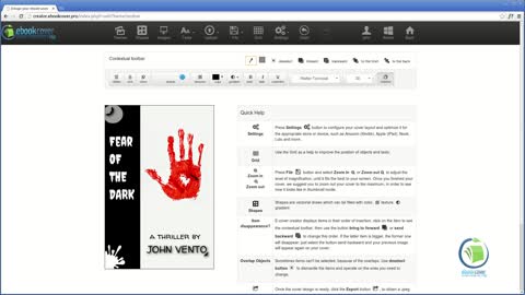
In this tutorial we will show you how to properly pick up colors in your cover, without wasting time to look for the correct ones. This will definitely help your cover to be uniform and more professional.
Tips for good ebook covers: looking for photos

Photos and images are everywhere on the Internet. Of course you are tempted to pick up any of the thousands of Google or Flickr images. But are you sure all these ones are for free? We could say that 99% they are not. In fact, if you don't have explicit authorization to use a photo, or you don't know who owns it, almost for sure you will use it illegally. As a matter of fact, you don't want someone to steal your writing, so it's better for you to inform about photos copyrights before using them. Photography is a profession exactly as writing, and owns to be paid. There are also some places in which you can get lots of free photos, but the other side of the coin is that these images are, usually, of very poor quality. There's a solution to all this. It's called iStock. It's a collection of professional photos that you can see in preview and then buy with a cost that is depending on the resolution. In this way you can download a preview photo for free - of course they are marked with their logo - and try it on your cover. When you're convinced, you can buy it. Apart from that, it's quite cheap. We talk of prices from 2 to 15 dollars, or more if you want the highest resolutions. Moreover, the website has a good quality control - mostly are photos from Getty Images - and a vast archive. They have a "term of use" contract, by which they allow you to use any images on you cover up to selling 499,999 copies. There are some other websites of good quality. One of these is Shutterstock, that is quite similar to iStock. The main difference is about buying: on Shutterstock to download images you have to buy a subscription of one month as minimum, in which you can download at maximum 25 photos each day. The good deal is that they are also in vector format, so if you can use Illustrator or another program to edit images, you can adjust them and modify them as you wish. Dreamstime works in between iStock and Shutterstock: you can make a monthly plan or you can buy with credits. Still, it has a section with free photos. We'll give you another option. In this website, called Freeimages, as the name says there are free photos you can use, with suggestions of paying images on iStock. Even if you can find something interesting, it's not really good quality and the number of photos you can find are quite limited. The third option is excellent if you want something very special: we're talking about the official site of Getty Images or Corbis. Quality is magnificent, prices are higher.
Tips for good Ebook covers: photos

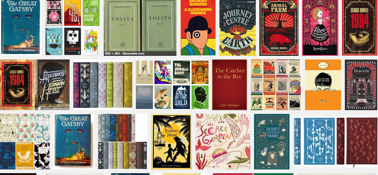
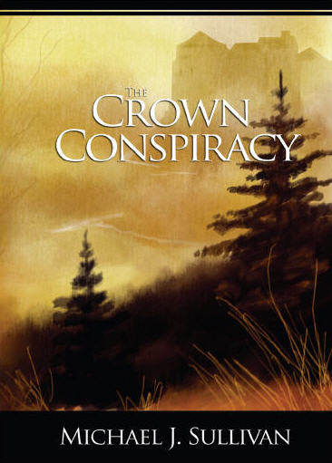
Background photos are extremely important when you’re making your cover. Although a cover conveys a mixed message of images, texts and colors, the first impact one reader has is on the photo. So, how to choose a good one? There is a very important rule to follow: be original and give the mood of your story, not the facts. A thing that is quite fundamental, as we saw in some precedent articles, is to avoid as much as possible clichés. In second instance, you have to understand that is not necessary to put an image which you feel to be perfect for the reader, to let him understand the novel. This is the wrongest thing you can do. Let’s make an example. You have a detective story in your hands. Maybe you found a photo that depicts perfectly your detective. Or you found an image the coincides perfectly with the main evil character, or with the victim. In these cases, what you are doing is just taking away the imagination from the reader, that is the most important thing while reading. It’s not a movie. Let readers form their proper image of characters and settings. When you are selecting a background picture, avoid anyone which will represent any person or object of the story. It’s just not nice to give to the reader, for example, a photo of one character, before one can actually step into the story and read about it. You have to choose an abstract image, one which will convey what is the general mood you’re conveying inside the story. But avoiding clichés. For a detective story maybe it’s better to stay away from foggy streets in the night, for example. But the use of a big fingerprint is not so much misused, as image. Still better to use a more abstract photo, which will not remind the reader exactly what is about the story – in the example before, a fingerprint could suggest the reader that the story will focus on its finding. Here below there are some more examples of Indie authors. In fact , are the kind of authors who make these mistakes more often, say because they want to spend not so much money, or they just don’t know how to do it or choose it.
Tips for good ebook covers: general rules

Every format has its own characteristics. Apart from the size, to design a cover for a paperback book is quite different than to do it for a Kindle ebook. Not only paper-book covers are seen - by all of us - in colors, while on our Kindle we see them in shades of gray. Also, ebooks are usually shown in miniatures, or thumbnails, on the stores. This changes quite a lot how you have to make your cover design. But let's start from the beginning, there are many useful tips. Which are the most important features of a kindle cover? Here there are four simple rules to follow: 1) First of all, it should stand out from other covers on the store's shelf; 2) it should convey the mood your story; 3) if you propose yourself to publish a series, with more books to come, it would be a good idea to start a brand, with common features that will be present in all of them 4) the cover has to be of high quality. If the quality is lacking, the reader will think that the writing will be poor too.
Tutorial 5 - Selection and layer options: easy to use!
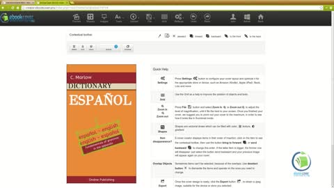
Selecting and deselecting, using layers and levels has always been difficult. But not with our software. In this tutorial we will show you how to take an image to the foreground, or to the background. Or even to put an item on top of another, or below a text to create its background. We will show you also how to use transparent layers to create special effects, just changing its level, and how to select multiple objects. Always using a real cover as an example.
Tutorial 4 - How to use shapes. Tips to get nice effects
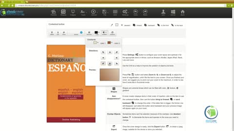
In this tutorial we will show how to use properly shapes in your cover: how to select them and modify them in size, rotation, using colors, textures or gradients. Or even transparency.


