Ebook Cover Size Specifications
Respecting ebook cover size specifications is essential.Unfortunately, many judge books by their covers. Sure enough, research has shown that the impression made by a cover has a direct impact on whether or not the book sells. This is particularly problematic for those seeking to create and sell ebooks, since the image seen by the client is much smaller than that of a traditional, printed book. Clients will only see a thumbnail image of the cover and so it needs to be both eye-catching and appealing without seeming overcrowded. Moreover design requirements and allowances may vary according to the format you intend to use or the store that will be principally marketing your work. Consequently, it is very important to research and follow ebook cover size and design specifications in order to produce a successful product. Particularly since cover designers often rely on the client to indicate the size, they even go as far as to ask for more money if the image needs resizing. As a general guideline, the ideal specifications for ebook formatting are: 600px x 800px using Jpeg format for the cover image. The file should be between 5KB and 2MB. Most designers will work according to these size and proportion requirements. This is the optimum size since it allows the cover to fill the screen without superfluous white spaces surrounding it. 500 pixels horizontally and 800 pixels vertically is seen as the minimum acceptable size for the cover, but this may result in a minute image dominated by white space. If you need to go beyond 800 on the longest size, never exceed 2000 pixels, as the formatters will simply downsize the cover before publishing. There are some general thumb rules to apply when designing your ebook cover. Firstly, it is generally better to use some colour for an aesthetically pleasing cover that catches the attention of potential buyers. Although the original Kindle formatting requires grey scale, most modern, updated versions allow and encourage the use of colour. Indeed, ebook can be read byt tablets too, which use color. Large fonts for the title are also good sellers and it is best to avoid having too many images as this makes the final product congested or even aggressive when it is downsized to a thumbnail. Obviously, the cover needs to look good when full-sized, but the fact that this is not what the client will see at first should never be forgotten. Finally, it is always recommended to create for images that will be downsized rather than designing a small cover that will be made bigger as this often leads to blurring. It is also necessary to take into account the fact that there are several types of ebook covers available, hence your final dimensions should be chosen according to the type of cover you intend to use the most. The embedded cover is the first page of the ebook and is most often sized differently from store to store. The catalog cover is the one which is displayed on the store’s website i.e. Amazon, B&N or iBooks. The print cover is used solely when the ebook is also going to be available in print edition. This cover will generally be much larger than the publicity or catalog covers, which are primarily used for ebooks. Finally, the publicity cover is used for books which will be advertised on websites, blog headers, business cards etc. For more information about the best sizes for this cover, you should consult your designer. When designing your cover always bear in mind on which device your ebook will most likely be read. For example, if your book is only going to be displayed on the store’s website, you should concentrate on the catalog cover. Ideally, your product should look good on all devices, but in order to increase your sales focus on the device you are going to use the most. Kindle is the principal ebook reader; therefore it is worth taking its specific requirements into account. These are as follows: - A minimum of 500 pixels horizontally and 1280 pixels vertically. - 72 dpi - JPEG or TIFF files for images. Kindle also has additional specifications for embedded covers: - 600px x 800px - JPEG - 300 dpi - Under 127 KB In order to successfully meet these requirements, 167 – 300 ppi is the ideal resolution, although it is also possible to use 72 dpi without any problems. Barnes & Noble on the other hand requires the following for the embedded cover: 600px x 730px JPG, PNG, or GIF files for the images. Under 300 kb. Finally, when using an Ipad the optimum specifications for the embedded Cover are: 600px x 860px; JPG, PNG, GIF; 132 ppi; Under 200kb As you can see specifications vary from one store to another and so it is important to know beforehand which retailer you intend to use. No matter the retailer you use, images should be RGB and not CMYK. The exact resolution and size vary according to the format and retailer used, but 600 pixels x 800 pixels generally works for all of them. Research is key when producing a successful ebook cover; you should discuss specifications with your designer and think about the exact kind of cover you wish to focus on and retailer that you wish to work with. As has been noted, the cover is primordial in selling your final product, so it is worth taking the extra time to make sure that it is attractive and conforms to requirements. Anyway, we are here to help. So, any question or suggestion is very much welcomed, and we will be happy to give you advices on what is best for you.
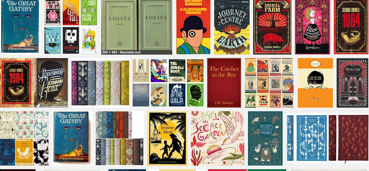
Ebook cover design awards

On a monthly basis, The Book Designer website hosts a competition to give ebook cover design awards. Hundreds of authors submit their work for evaluation every month, suggesting there is something to be said, whether to learn from the success or failings of others or discover which designers are the most successful and thus worth hiring for the creation of your cover. It is particularly useful for eBook publishers and authors, since winners are awarded with a gold star and the right to display special badges on their websites indicating the merits of their work to potential buyers. The results are worth viewing above all by those who work in the industry (from eBook retailers to designers and publishers) and are trying to make a name for themselves in the eReading world. They also make interesting viewing for web browsers who simply want to get an idea of what makes or breaks an eBook cover. In this article, we will use the winning covers as a basis for understanding what an effective cover entails by browsing the competition entries of the past few months. The first reason that it is worth following these awards is to discover which designers produce the most successful covers. On the whole, gold stars are generally awarded to covers created by professional designers rather than the authors themselves who are not specialized. This is not to say that "do-it-yourself” covers always fail to match up to those that are professionally designed. For example, in November 2012, Tracy R. Atkins submitted a winning entry, Aeternum Ray, designed by the author herself. This cover successfully uses a graphic that reflects the technological and virtual themes of the novel. As well as indicating which designers to hire and whether to employ one at all, the eBook cover awards are also useful for discovering common features that make effective covers. To begin with, colour, typology and font size should be carefully selected. For the cover of The Last Supper, Ana C. Nunes effectively employs a unique font that echoes the scary nature of her work without being clichéd. On the other hand The Hand Man’s Wife by Artemis Greenleaf uses an overly pale blue colour for the title that is lost in the dark background and barely legible. Selecting images is also an important area of eBook cover design judging by these awards. Observe the example by a November 2012 winner - Laura Rahme – who submitted The Ming Storytellers designed by Caryn Gillespie. Here, the artwork evokes well the mystifying and oriental backbone of the novel with a dark blue colour scheme and a sensual female representation that channels the main protagonist. This competition also provides examples of what does not work when creating an eBook cover. For example, overcrowding proves to be a common issue in eBook cover design. The illustration and typography should converge cohesively and it is better to opt for a single, central image rather than overloading the screen with several pictures. Six Seconds by Kit Foster testifies to this fact, since the congestion of shapes and effects simply results in an aggressive effect that is neither appealing nor enticing and thus unlikely to be profitable. Emily Anne: A Ghost’s Story by Don McNevin also reminds us that it is important to bare in mind that an eBook cover will be most likely downsized into a thumbnail format and thus reproducing the print cover is not always advisable. Overall, it is worth following these awards to both get ideas on how to design your eBook cover, which designers to use if you intend to use one and how to match illustrations with typography. Although it is possible to get an idea of the best eBook covers by browsing eReading stores such as iBooks or Amazon.com, this can be time-consuming. On the other hand, The Book Designer website eBook cover awards has everything there for you to see at the click of a mouse.