Tips for good ebook covers: looking for photos
Photos and images are everywhere on the Internet. Of course you are tempted to pick up any of the thousands of Google or Flickr images. But are you sure all these ones are for free? We could say that 99% they are not. In fact, if you don't have explicit authorization to use a photo, or you don't know who owns it, almost for sure you will use it illegally. As a matter of fact, you don't want someone to steal your writing, so it's better for you to inform about photos copyrights before using them. Photography is a profession exactly as writing, and owns to be paid. There are also some places in which you can get lots of free photos, but the other side of the coin is that these images are, usually, of very poor quality. There's a solution to all this. It's called iStock. It's a collection of professional photos that you can see in preview and then buy with a cost that is depending on the resolution. In this way you can download a preview photo for free - of course they are marked with their logo - and try it on your cover. When you're convinced, you can buy it. Apart from that, it's quite cheap. We talk of prices from 2 to 15 dollars, or more if you want the highest resolutions. Moreover, the website has a good quality control - mostly are photos from Getty Images - and a vast archive. They have a "term of use" contract, by which they allow you to use any images on you cover up to selling 499,999 copies. There are some other websites of good quality. One of these is Shutterstock, that is quite similar to iStock. The main difference is about buying: on Shutterstock to download images you have to buy a subscription of one month as minimum, in which you can download at maximum 25 photos each day. The good deal is that they are also in vector format, so if you can use Illustrator or another program to edit images, you can adjust them and modify them as you wish. Dreamstime works in between iStock and Shutterstock: you can make a monthly plan or you can buy with credits. Still, it has a section with free photos. We'll give you another option. In this website, called Freeimages, as the name says there are free photos you can use, with suggestions of paying images on iStock. Even if you can find something interesting, it's not really good quality and the number of photos you can find are quite limited. The third option is excellent if you want something very special: we're talking about the official site of Getty Images or Corbis. Quality is magnificent, prices are higher.
Tips for good Ebook covers: photos

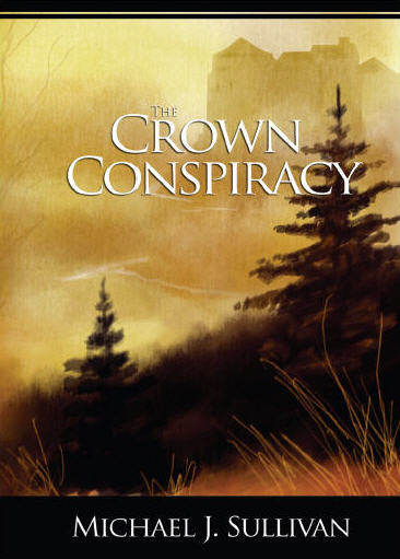
Background photos are extremely important when you’re making your cover. Although a cover conveys a mixed message of images, texts and colors, the first impact one reader has is on the photo. So, how to choose a good one? There is a very important rule to follow: be original and give the mood of your story, not the facts. A thing that is quite fundamental, as we saw in some precedent articles, is to avoid as much as possible clichés. In second instance, you have to understand that is not necessary to put an image which you feel to be perfect for the reader, to let him understand the novel. This is the wrongest thing you can do. Let’s make an example. You have a detective story in your hands. Maybe you found a photo that depicts perfectly your detective. Or you found an image the coincides perfectly with the main evil character, or with the victim. In these cases, what you are doing is just taking away the imagination from the reader, that is the most important thing while reading. It’s not a movie. Let readers form their proper image of characters and settings. When you are selecting a background picture, avoid anyone which will represent any person or object of the story. It’s just not nice to give to the reader, for example, a photo of one character, before one can actually step into the story and read about it. You have to choose an abstract image, one which will convey what is the general mood you’re conveying inside the story. But avoiding clichés. For a detective story maybe it’s better to stay away from foggy streets in the night, for example. But the use of a big fingerprint is not so much misused, as image. Still better to use a more abstract photo, which will not remind the reader exactly what is about the story – in the example before, a fingerprint could suggest the reader that the story will focus on its finding. Here below there are some more examples of Indie authors. In fact , are the kind of authors who make these mistakes more often, say because they want to spend not so much money, or they just don’t know how to do it or choose it.
Tutorial 3 - Create a cover in the suitable format for the book store you have chosen
Which format to choose? It depends on what you have to publish: book or ebook? And with whom? Amazon, Lulu, or Apple? Every company has its own format. In this tutorial we will explain you how to choose it and how to change it. We will show you, also, how to solve problems that can occur changing the format while working on a cover, and how to use properly your own images for your cover's background.
Tutorial 1 - An overview of our ebook cover creator software
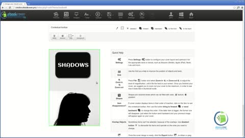
In this tutorial we will show how to use the main functions and options inside the software. We'll show you the different menus, the working area, how to choose images, colors, texts and shapes. And you will learn how to save and export your work. Everything creating a real cover, ready to use.
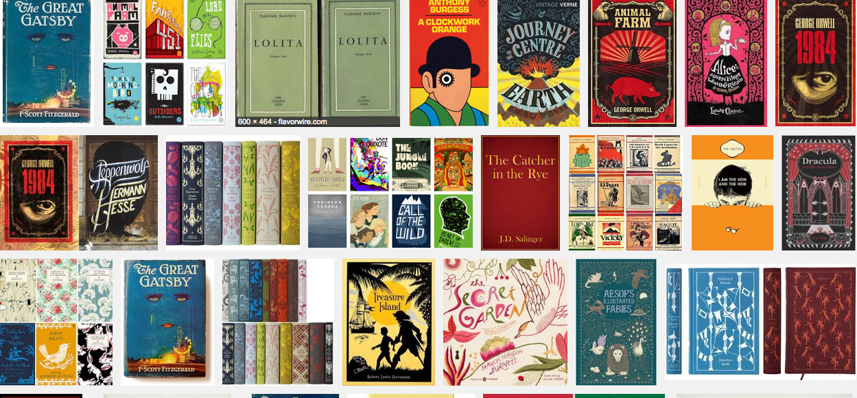
Book Covers Clichés: general rules
When you design your cover it can occur you fall into some clichés, which are images, colors, backgrounds which are used in most of the covers for some topic. Although it's absolutely normal, you have to recognize them and avoid them as much as possible. Something, anyway, almost for sure will slip you out, but don't worry. Let's take an example: Africa. Have you noticed the covers of the books on this topic? I'll show to you right below. Noticing anything? Yes, the colors; yes, the images. Also big authors fall into it (or their graphic designers anyway). It's a common imagination, and in some ways it conveys to the reader what is the book about, or where the story is taking place. Usually about Africa we can see: a sunset - or sunrise; an acacia tree; hot colors (which conveys an image of hot temperatures), from yellow to red; some classic African animals, like elephants, giraffes, or lions. Of course not every author had this idea for their covers. We can say, however, that is very common for a story which is set in Africa to have these features, despite the story has nothing to do with sunsets or acacia trees, or even animals. How to prevent these clichés when you are designing your cover? Let's give you some tips. Google on images "cover book Africa", and replace Africa with your main object, and you'll have a fair idea. Or go to an on-line book or ebook store and search "Africa", all the book covers will come out. You just have to have a little patience. Don't stop at the first page, but go on a while, to have a more complete idea.
The benefits of an attractive ebook cover

As Aeschylus said, "appearances are a glimpse of the unseen” and, whether we like it or not, appearance does matter. Consequently, when it comes to selling your ebook it is imperative to accompany it with an eye-catching and attractive ebook cover in order to increase your sales, saving you both time and money in the long run. In this article, we will explore the ways in which a professional ebook cover can improve both the quality of your work and make increasing your sales much easier. 1. Make a good first impression It is important to note the old adage that there’s no second chance to make a good first impression. Unfortunately, many people do judge books by their covers simply because they don’t have the time to read the material in depth before making a purchase. This is particularly true of the online market, since people who surf the web are often casual readers who jump from one website to the next. Therefore, without a good ebook cover that makes a lasting impression, it is unlikely that many will even consider buying the work. 2.Make your book memorable and eye-catching An effective cover is a good way of guaranteeing that your book is memorable. It allows you to make use of various advertising techniques, such as appealing colors, images and slogans, in order to catch the reader’s eye and imprint upon his memory. In this way, the work is made to stand out as an aesthetically pleasing product that entices potential readers and buyers. 3.Create a "taster" for your book A good cover can serve as an excellent "taster" or "teaser" of the overall work. It can capture the book’s contents, themes and key issues in just a few words and pictures, providing on-line browsers with an idea of the product that furthers their desire to purchase it. 4. Convince consumers to buy In all of the above ways, great covers convince consumers to buy the product. This leads us onto the next advantage of a professional cover: the opportunity to increase your sales. Indeed, this is perhaps the principal reason to create a cover in the first place. Many are worried about the cost of having a cover professionally made, however it has been shown that doing so often increases the overall profit. This is due to the fact that a good cover guarantees a higher number of sales and therefore an increase in revenue . The money spent on having a cover professionally produced also seems to provide a greater motivation for most ebook writers to develop the quality of their work, since they have invested in it. This often improves the value of the overall product and therefore makes it more likely to sell. 5.Increase your number of affiliates In a similar way, covers can also increase your number of affiliates, since it makes your work more appealing to others who are unlikely to advertise the product if they find it boring or unappealing. 6.Save time and so improve the content of the work Not only does an effective cover save you money, if you have one designed professionally you will also have more time to dedicate to the work itself. This further increases the quality of the product, since you can develop its content instead of worrying about producing a cover yourself. 7. Create a renewable investment It is worth taking into account that a good cover is a long-term, renewable investment. You can adapt the cover over a collection of works, which allows you browsers to easily recognize your work. You will only need one professionally designed cover in order to create a branded-product that can be used for several books in the long term. Overall, the benefits of having an ebook cover professionally designed greatly outweigh the singular disadvantage of the initial cost involved in doing so. Indeed, research shows that a good cover is essential to generating an attention-grabbing, high quality product that is much more likely to sell