Success case: Loneliness

Simplicity is always the key. Here there's an example of it. It's so simple that we don't even have to use many words to describe it. It's a cover for an essay, but don't you agree that it could be alright to use it for a novel too? This cover follows all the rules we have written in our blog. The conceptual meaning of "loneliness" is represented by the small, isolated point. If we make it as a thumbnail, we don't even see it. But it doesn't matter, does it? Plain color, almost no graphic, but an effective visual concept. One interesting point in this cover is about the title. We said already that the font has to be readable and clear. Are you noticing anything in this one? Maybe not, because it follows this rule. If, however, we look better, we see that the "i" is the 1 number. It's very easy to create such an effect, and it's very intriguing too for a reader. The sub-title, as we can call it, is blank on a red rectangle. It's almost not visible, with some words in italic and other ones that are normal. The effect comes out only when we have decided to enlarge the thumbnail on the store, so we get into some curiosity in reading what it's not so much readable. Finally, the authors' names are in a smaller font in the bottom part. They are not marked, but still visible.
Success case: The crown conspiracy

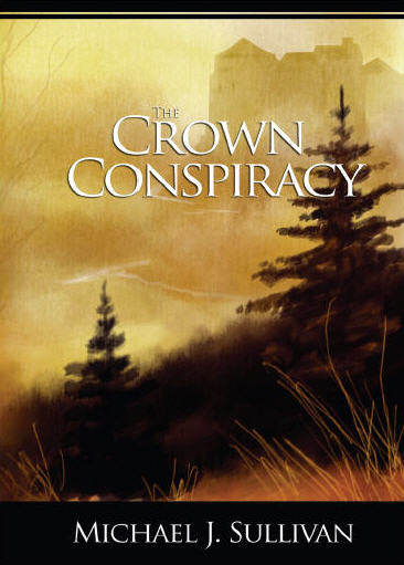
Micheal Sullivan, author of The crown conspiracy, has been publishing a lot since this book. He made a lot of way out of the market, but everything has started from this self-published book in 2008. He's an American author of epic fantasy & science fiction, best known for his debut series, The Riyria Revelations, which has been translated into fourteen languages, and which The crown conspiracy is a part. In 2012 io9 named him one of the "Most Successful Self-Published Sci-Fi and Fantasy Authors". Let's see the final cover chosen by the author to represent its book. So, let's start from the mood. This was the first Sullivan's book, so nobody knew him, neither what kind of genre was the story about. Still, the first thing comes to impact our eyes is the title, especially the word "crown". Then we pass to the background picture, and we see a nice, foggy landscape with some medieval city. We can then infer that the book is about some mysterious story in the middle-age. The word "conspiracy" of the title fits with the picture we built in ourselves. As you can see there are no clues on what is really the story about, but that's the point. About the title, it's written in clear, big, capital letters. As a thumbnail, both title and image are pretty clear. Finally, the author's name is in the bottom part, with a black rectangle as background. The font size is much smaller than the title, but it's very much readable because of the contrast - white on black. In this case we can see that the author didn't want to mark his name, sacrificing the title which was far more important; still, he wanted it to be clear, in case someone wanted to remember it. That's the key: be simple. We also know a little about the cover creation process of Sullivan. He said in an interview: "We wanted to avoid placing any imagery of characters in the cover, to leave the reader free to imagine them as they wished. (...) The cover that now appears on The Crown Conspiracy was originally conceived as a traditional watercolor, but I realized that I would not be able to digitize it to an adequate dpi for printing. I also wanted to have more control over the finished image, so that I would be able to adjust the height and/or width to accommodate text, or other formats such as bookmarks, that require more sky. In the end, I decided to create a watercolor image entirely in Photoshop." Of course you should be a good Photoshop user to get such a result. Still, you can modify any image that you can buy on some store, and use it as background for your cover. But we offer another option: you can browse our images database.
Success cases: Meredith Wild

It's very good to look success stories of Indie authors. I guess everyone of you has made up his mind reading as much as possible on how to hit it big time. However, let us concentrate on the cover part of success authors. Let's start from a bestselling Indie book on Amazon: Hardline of Meredith Wild. She started as Indie, now she's one of the New York Times and USA Today best authors - of course the story matters too. Here's the cover, on the left. As we caught some ideas and examples in the article about photos for kindle covers, here we find the same topic expressing itself. First of all, simplicity; second, an abstract image. We have texts above and below, the photo is separating them, although in some other versions the photo comes up to the upper part of the cover. The most important thing is that the image in the center convey us the book's mood. Especially the purple color, with something that appears as a blanket, tells us there's something about love. While the general dark colors suggest mystery. We infer from the sub-title (the hacker series three) that: 1- it is about some spy-tech-story 2-it's a series, so we think: let's give it a try and then buy the other two books; or, let's read the other books before. So, photo plus title plus subtitle = mood of the story. We don't have a clue what is the book about, but we can understand that is a hack loving story. Intriguing, isn't it? It's an analysis to let you understand how to make your covers. Of course, don't copy any example, but try to figure out what is the mood of your story, and put it in images. That will work out with a very good cover for your book.


